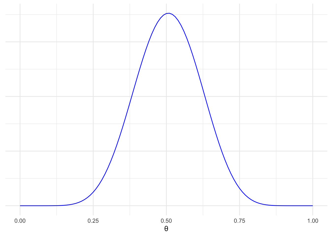
One of the many reasons I like Bayesian inference is that key Bayesian summary statistics really lend themselves to graphical display. Well-done visualisations can demonstrate a huge amount of information in a very short amount of time, demonstrate complex relationships between different elements, and do so for audiences that don’t have a grounding in statistics. Two of these are intervals: the Highest Density Interval (HDI), and the Region of Practical Equivalence (ROPE). The HDI is a type of credible interval1, and is the narrowest range of a probability distribution containing some probability density. For example, the 95% HDI contains 95% of the area under the curve (and therefore 95% of all possible outcomes), over the narrowest range of probabilities. The ROPE is a range of effect sizes that are clinically negligible. How much the HDI and the ROPE overlap give an indication of where our belief about a given intervention should fall.
1 A credible interval is a range of values in which we expect the true population parameter to fall.
I’ve adopted R as my statistical language of choice, and use ggPlot for all but the most simple figures (and certainly for anything is that is going in a publication). One of my disappointments with ggPlot is that although it is easy to plot a probability density using the geom_density() function, the area under some part of the curve can’t be shaded explicitly - it’s an all or nothing thing. Although a few packages (e.g. bayestestR can plot credible intervals, they don’t offer the flexibility of ggPlot in styling these figures.
Overview
- Use simulation to generate a posterior distribution
We will use calculate the posterior distribution for the difference between groups, i.e. the posterior for the effect size of an intervention. - Calculate the HDI on the simulated data
- Derive the function that describes the posterior distribution
- Plot the area under part of the curve using
stat_function()
Approach in Detail
Firstly, we’ll generate some data. We’ll conduct a very simple simulation - we’ll use a Beta(10, 10) distribution for both intervention and control groups, a reasonably narrow prior and an assumption of no difference between groups. Since this example is only going to look at the posterior distribution and it has a conjugate prior, we can avoid simulating the prior and just do the posterior. Before that though, we need to conduct a trial. The results are impressive: only half of the intervention group had the outcome, compared to three-quarters of the control group:
# Libraries
library(tidyverse)


# Form some trial data
trial = tribble(
  ~grp , ~event, ~n,
  "int", 50   , 100,
  "con", 75   , 100
) |>
  column_to_rownames("grp")
The beta posterior distribution incorporates the same shape values as the prior distribution, alongside the results of our trial2. We’ll merge this dataframe with the priors, and then calculate a prior for the difference of priors and posterior.
2 This approach is overkill for this example, but I’m reusing code I’ve written for another paper.
# Set conditions
nSim = 10^5

# Function to calculate the posterior distribution
beta_posterior = function(shape1, shape2, events, n.group, n.sim){
  # Update the prior with events to get shape values for the posterior
  post.alpha = shape1 + events
  post.beta = shape2 + n.group - events

  # Calculate and return beta posterior
  post = rbeta(n.sim, post.alpha, post.beta)
  post
}


# Simulate posterior
posterior = data.frame(
  con = beta_posterior(shape1 = 10,
                       shape2 = 10,
                       events = trial["con",]$event,
                       n.group = trial["con",]$n,
                       n.sim = nSim),
  int = beta_posterior(shape1 = 10,
                       shape2 = 10,
                       events = trial["int",]$event,
                       n.group = trial["int",]$n,
                       n.sim = nSim)
  ) |>
      mutate(diff = int - con)
Now we have a posterior distribution for the control and intervention groups, as well as the difference between them3. The next bit is where the magic happens - we’ll calculate the function that approximates the distribution of effect size results, as well as the 95% HDI.
3 Differences should be calculated by randomly selecting one value from each distribution and taking the difference - but since each column was generated randomly we can simply subtract one from the other which makes this much easier.
library(HDInterval)

# Calculate function of the difference in the posterior distribution using approxfun()
postDiffFun = posterior |>
  pull(diff) |>
  density() |>
  approxfun()


# Calculate the highest density interval from the raw data
hdi = posterior |>
  select(diff) |>
  HDInterval::hdi(credMass = 0.95) |>
  unname() |>
  round(digits = 2)
The last stage is simple - plot the results. I’ve assumed a ROPE of 5% around a null effect.
ggplot(data = data.frame(x = c(-1, 1)),
                      aes(x)) +
  # Vertical line at 0
  geom_vline(data = NULL,
             xintercept = 0,
             colour = "black",
             alpha = 0.3) +
  # Curve
  stat_function(fun = postDiffFun,
                geom = "line",
                colour = "#F8766D") +
  # HDI
  stat_function(fun = postDiffFun,
                aes(fill = "95% HDI",
                    colour = "95% HDI"),
                geom = "area",
                xlim = c(hdi[1], hdi[2]),
                alpha = 0.5) +
  # ROPE
  stat_function(fun = postDiffFun,
                aes(fill = "ROPE",
                    colour = "ROPE"),
                geom = "area",
                xlim = c(-0.05, 0.05),
                alpha = 0.5) +
  # Cosmetics
  scale_x_continuous(expand = c(0, 0),
                     limits = c(-0.5, 0.1),
                     breaks = c(seq(-0.45, 0.05, 0.2), hdi, -0.05, 0, 0.05)) +
  scale_y_continuous(limits=c(0, 8),
                     expand=expansion(mult=c(0, 0.05))) +
  theme_light() +
  theme(axis.text.y = element_blank()) +
  labs(x = expression(theta[1] - theta[2]),
       fill = NULL,
       colour = NULL,
       linetype = NULL,
       y = NULL)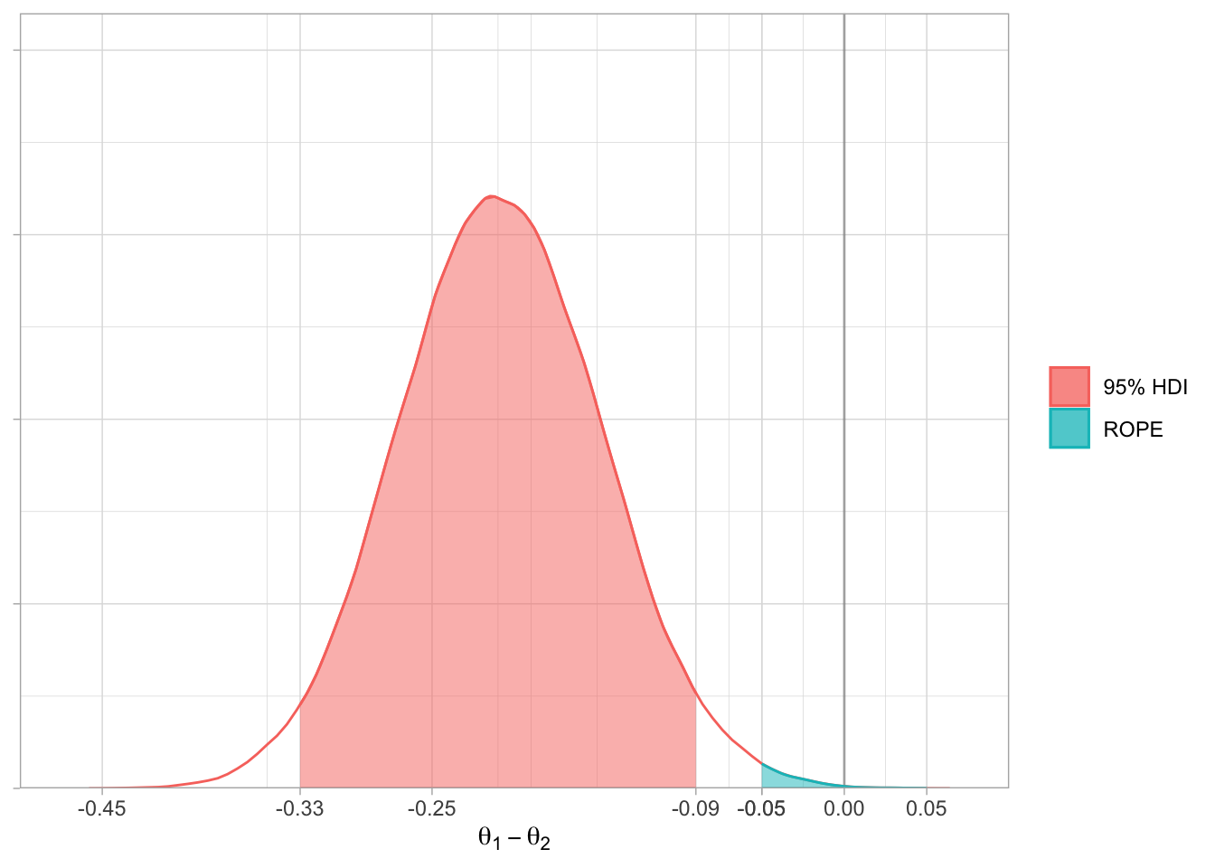
Although more wordy, this produces a much nicer graph than the Bayesian packages I have used and allows further manipulation of the graph using the extensive list of options provided by ggPlot.